LNK
Business card reinvented
Total Duration: 6 weeks
Store launch: TBD
In our rapidly evolving digital age, traditional business cards are rapidly becoming outdated. Our project is centered on creating a cutting-edge digital business card platform, merging ease-of-use with modern, sleek design and enhanced functionality.
Digital networking has become the norm, professionals worldwide are seeking new ways to share contact information and personal branding digitally. With an increasing focus on sustainability, this initiative also aligns with the global push towards paperless solutions.
Role
A team of three, I assumed the roles:
User Experience (UX) Designer
User Interface (UI) Designer
Interaction (IxD) Designer
Digital Storefront Designer
Tools
Figma
Illustrator
Photoshop
Octopus
Deliverables
Combination of UX/UI and E-commerce tasks:
Low-fidelity wireframe
Personas
Task flows
Design system
Usability tests and findings
Brand identity
Packaging design
High-fidelity prototype
Product photography
Virtual Store Design
Social Media advertising
The Opportunity
Our digital business card project was inspired by a growing market opportunity. Each day, 27 million business cards are printed, yet only about 10% are saved, signifying a huge inefficiency. Recognizing these shifts, we developed a digital business card platform to meet these evolving needs and redefine professional networking in the digital age.
While a handful of digital business card solutions do exist, we have noticed a scarcity of options that effectively combine simplicity, practicality, and a clutter-free approach. We aim to stand apart by developing a digital business card platform that is user-friendly, functional, and avoids unnecessary complexities, offering a clear and concise way to share professional information.
Without a doubt, we were drawn to push the boundaries of what is currently available.
Pain Points
Social media icons lack accompanying text descriptions, creating confusion for individuals unfamiliar with the symbols.
Extended personal URLs are overlapping with adjacent icons, resulting in a cluttered user interface with no method to conceal these lengthy links.
A "pro account" is required to access basic features.
The excessive focus on content compromises the aesthetic simplicity that is integral to an effective business card.
A high price tag, making it unaffordable.
Design Approach
By providing descriptions that explicitly distinguishes each icon (e.g., "Facebook," "Twitter," "LinkedIn"), we aim to eliminate ambiguity and ensure that users can easily understand and navigate the social media links.
No “pro account” is required to access basic features.
Prioritizing a minimalist design approach which eliminates clutter.
With a price fit for ALL.

“Our goal is to resonate with a broad audience, encompassing an essence of elegance and minimalistic design.”
Research
My research journey started with a comprehensive market analysis, carefully analyzing competitor products while pinpointing their areas of vulnerability. To better understand user needs, I delved into competitors customer feedback and reviews, allowing me to extract common pain points and create accurate personas. Through user surveys, I successfully identified crucial variables, enabling us to craft a seamless and intuitive app flow that caters to the needs of our target audience.
Relevant Findings
Prices begin at a range of $50 for a single card, all the way to $750 dollars for a pack of 10. Some customers have to pay the high price tag even though they only want a few features.
Some cards are fabricated with heavy material, enhancing their durability but inadvertently adding undesired weight, resulting in inconvenience.
Limited customization
Poor print quality
Defining Personas
A crucial step
With an enhanced grasp of the desired preferences of our target demographic, I was able to break down the research into three different personas that will be used to drive design decisions moving forward. These personas exemplify three types of people: The working professional, the entrepreneur and the business owner.
Journey Map
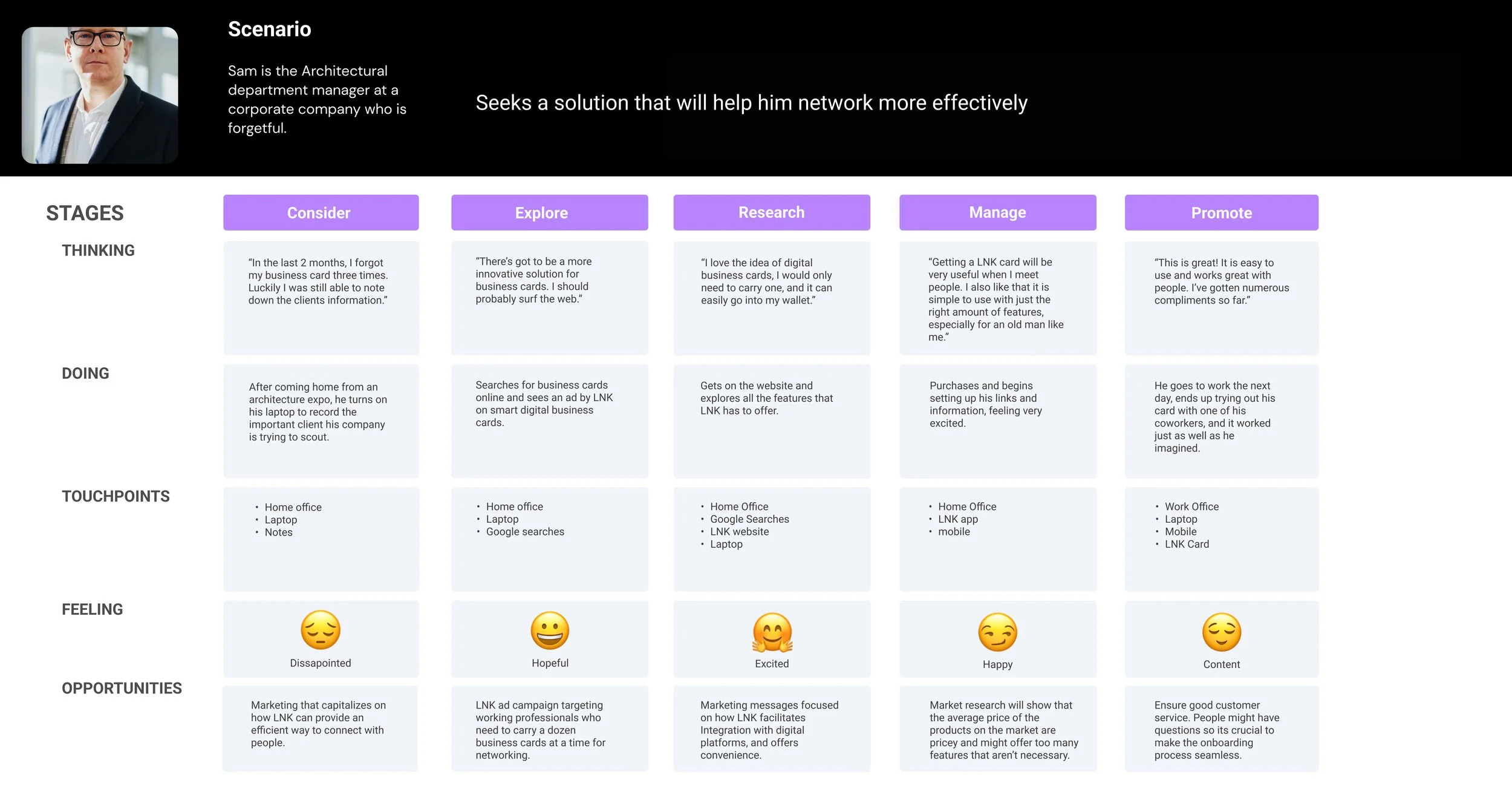
Exploring the user’s journey
Despite having their individual frustrations, all personas share a common need for an effective contact exchange method that ensures reliable communication even after parting ways. Sam’s journey served as a profound inspiration, reminding me of the significance of networking and the immense professional growth it can unlock for individuals no matter the trade.
User Task Flow
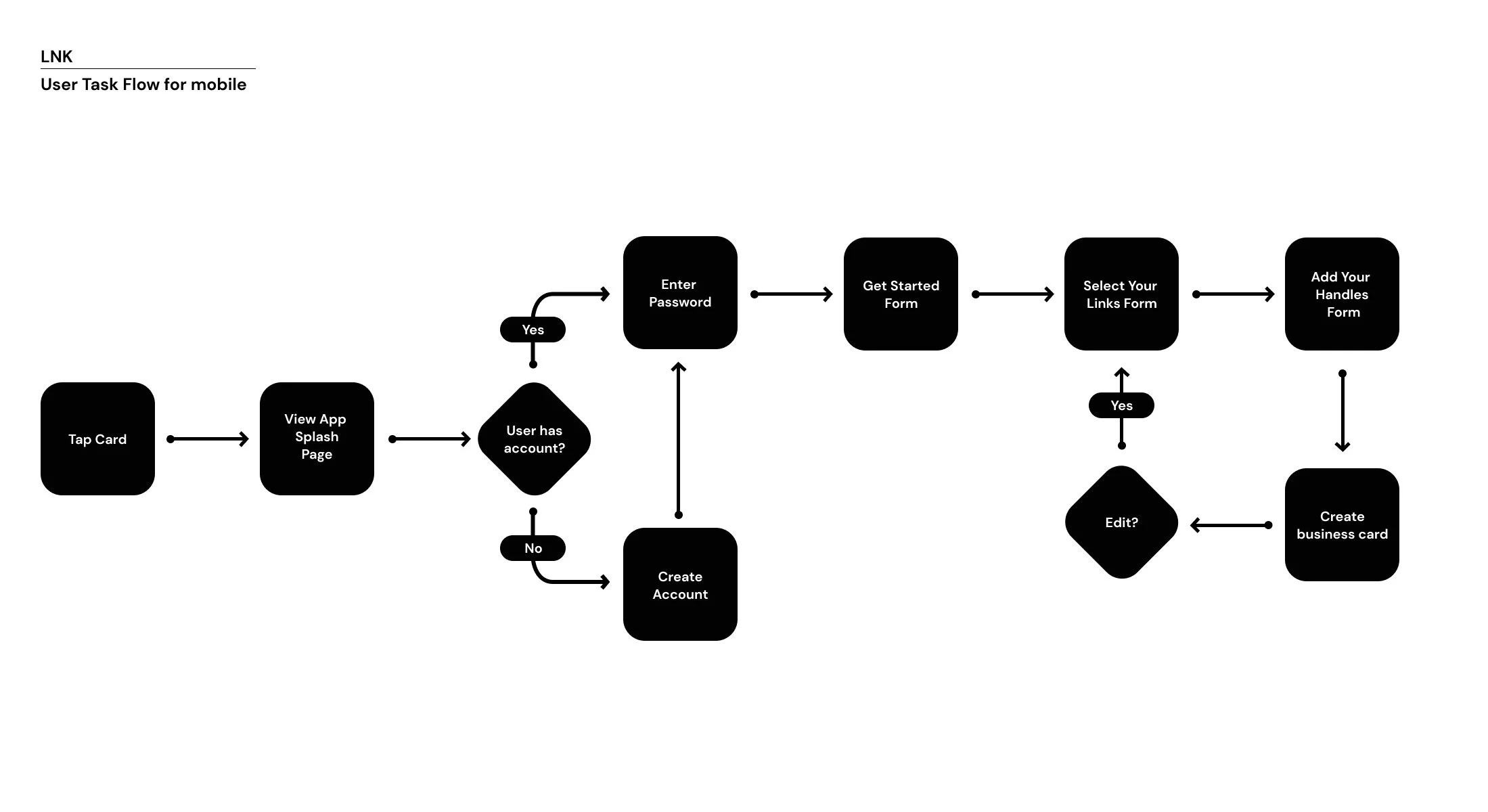
Creating data driven functionality
The User Task flow diagram was developed in order for the team to review the step-by-step journey that users will take to accomplish the final goal. By mapping out the user's interactions, decision points, and system responses, a task flow helped us identify pain points, optimize the user experience, and streamline the user's path towards task completion. It enabled us to understand user expectations, uncover potential bottlenecks, and make informed design decisions.
Sketches
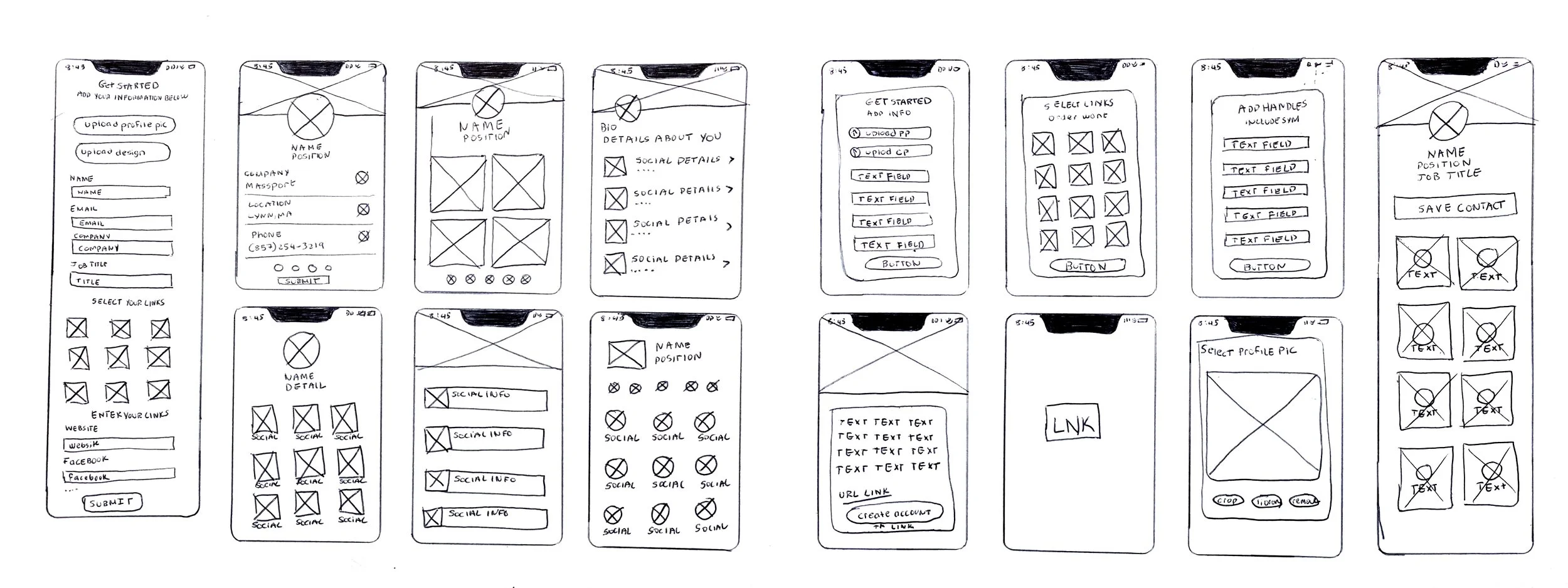
Communicate, iterate, and validate design
Rapid sketching enabled me to iterate quickly and make multiple versions or variations that I could present to my team for review. By doing this exercise, I discovered that the optimal approach lies in using well-structured modules with generous negative space and predictable design patterns. This strategy ensures an intuitive and simple user experience.
Low Fidelity
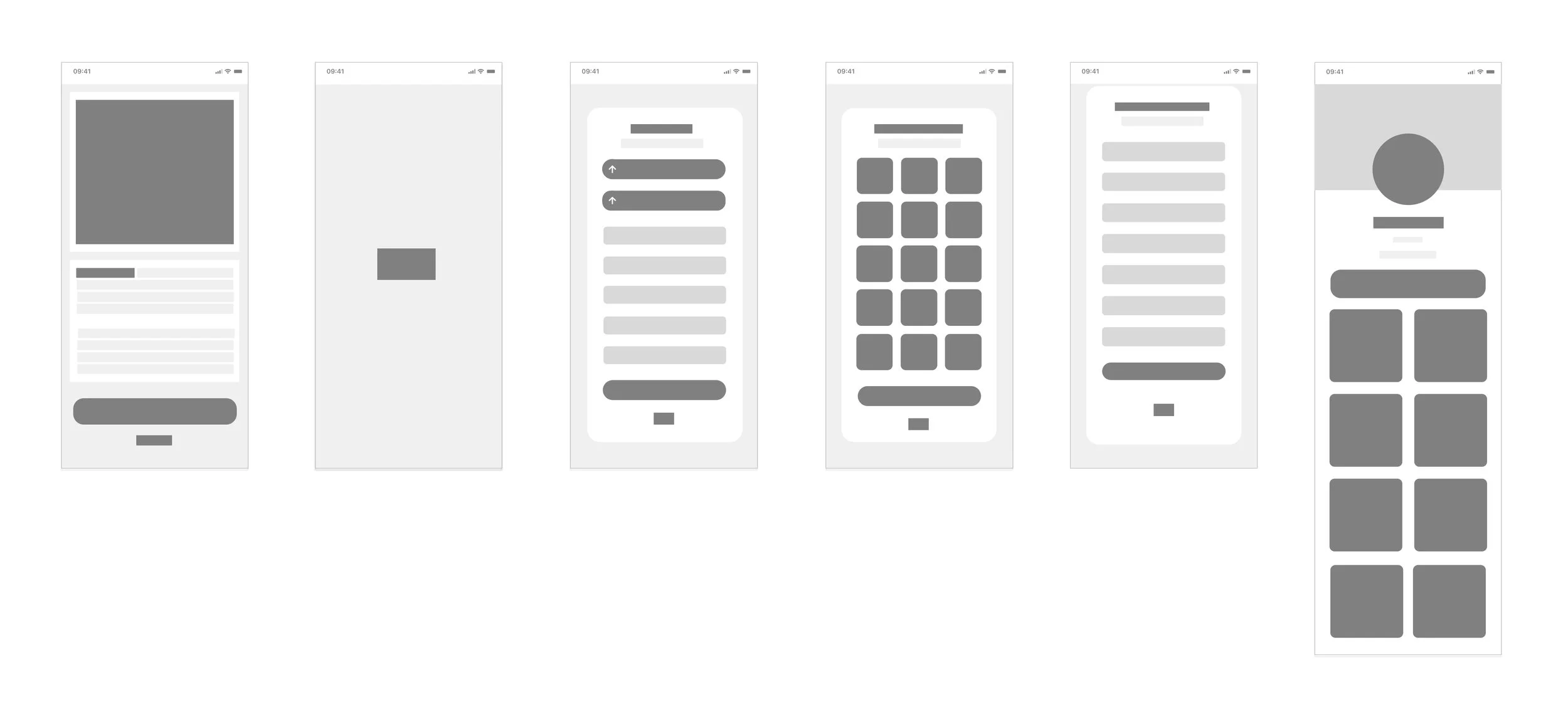
From Concept to Creation
This process has allowed me to focus on the user's expectations and behaviors as they flow through the app. I gained a deeper understanding of the anticipated outcomes which in turn guided me to make the necessary adjustments moving forward.
Design System
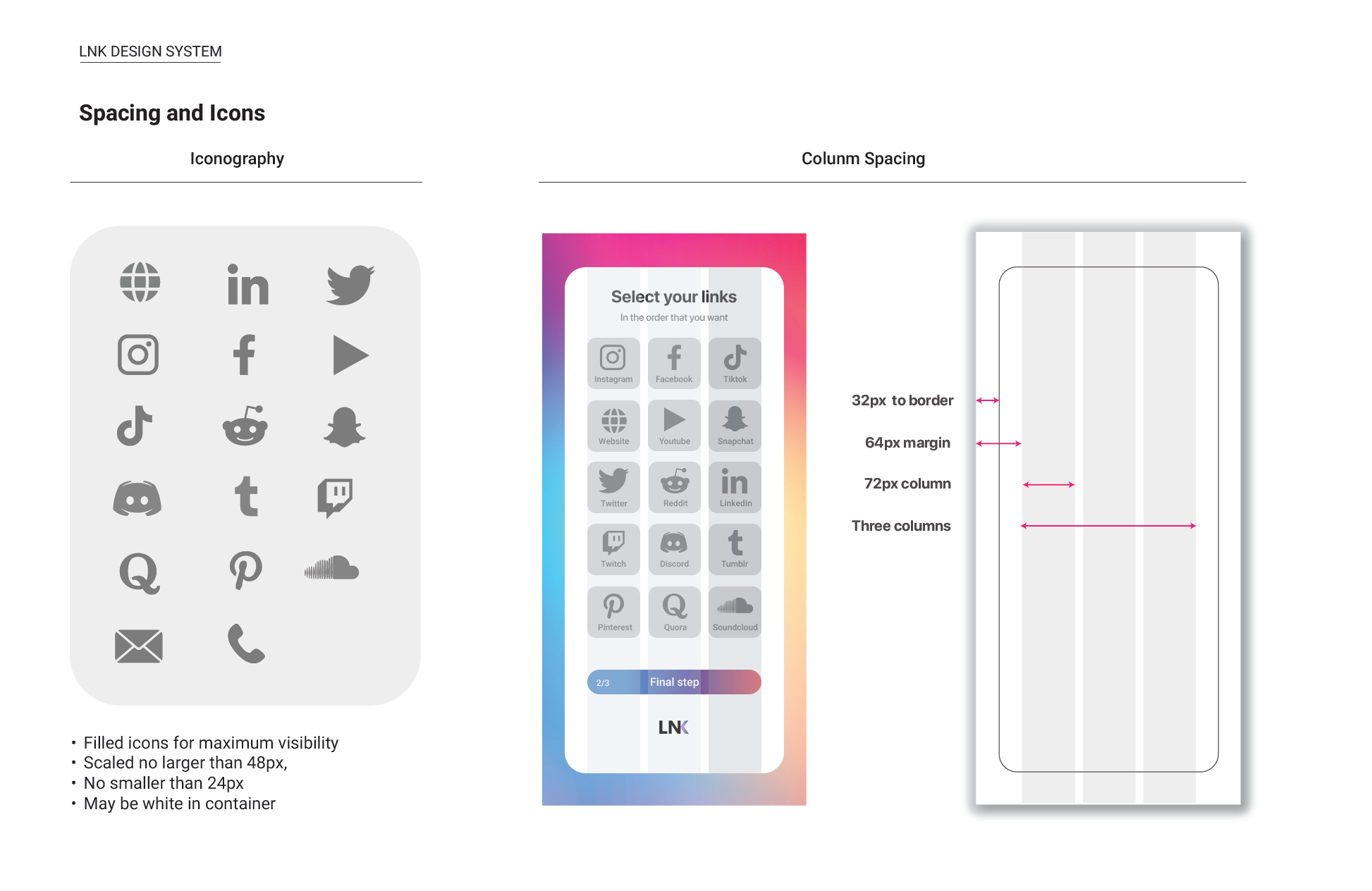
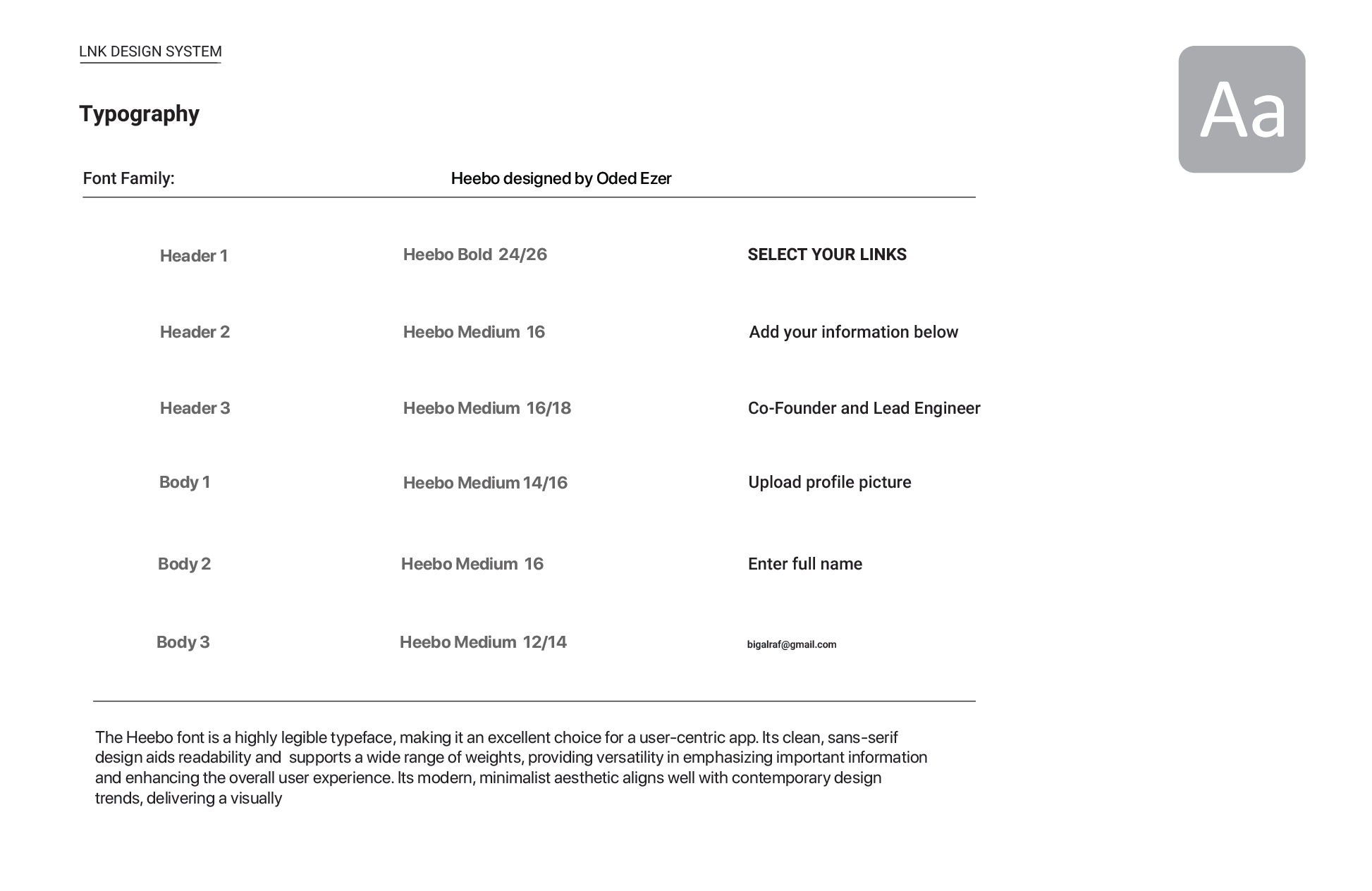
Colors, Icons, Typography, Components, States
End Product
High Fidelity
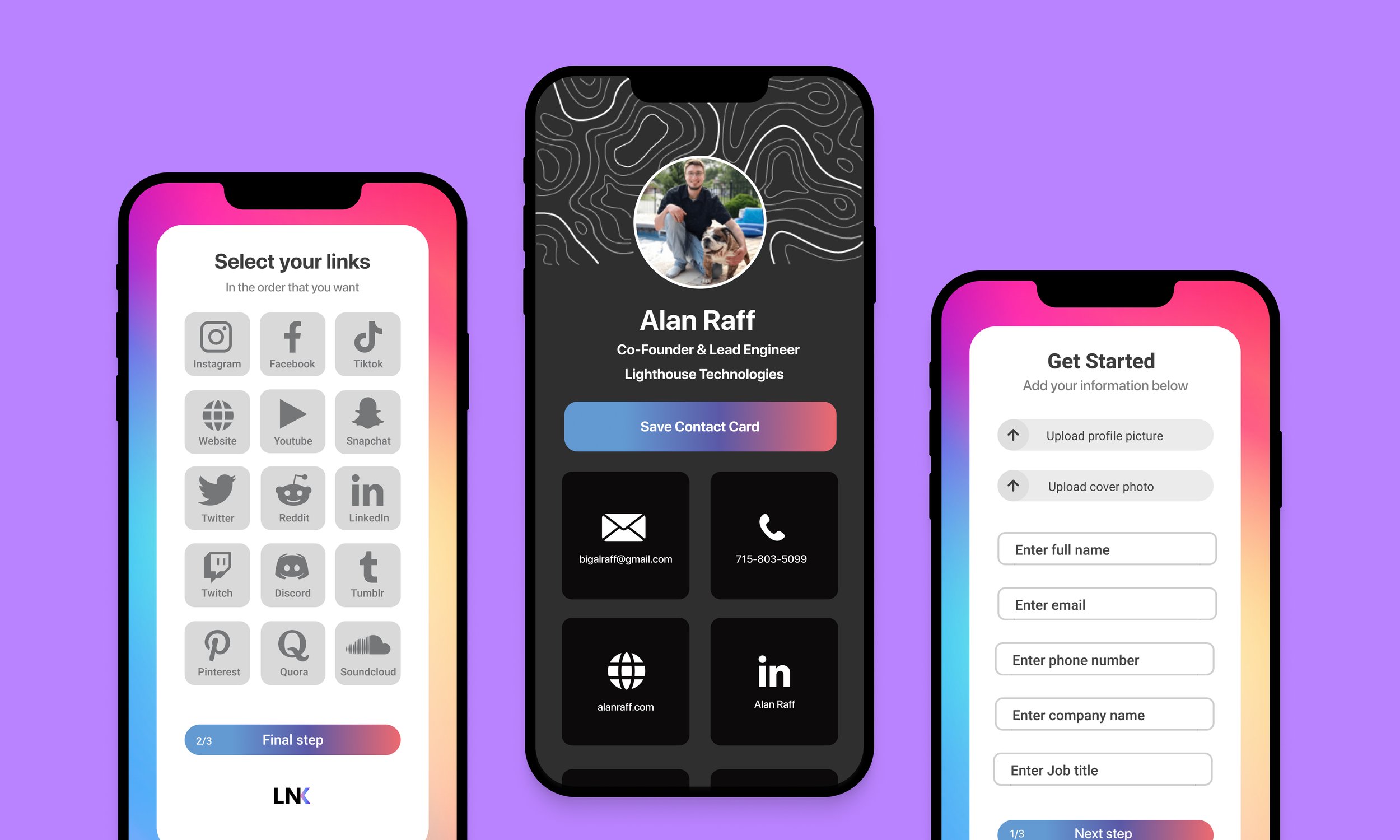
High fidelity prototyping was an enlightening process that enabled a comprehensive analysis of the research and testing outcomes. While successfully achieving the goals of minimalism and appealing design, it is important to recognize that the app's limited versatility may be frustrating for some users. This limitation restricts creative expression and editing options beyond the customization of the background image and profile picture.
(Clickable prototype to the right, and also available on Figma)

Lessons Learned
Key Takeaways/Future development
Feedback from users revealed that the app's rigidity limits their ability to highlight or add information to their most prominent social platforms.
By expanding the range of design templates, users will have the freedom to select from various styles and colors, transforming their experience from generic to personalized.
Certain users highlighted a desire for additional options beyond the traditional card format. They expressed that having alternative options would facilitate easier sharing, especially in scenarios such as being at the gym.


